Visualizing Map Data With GGplot and Leaflet

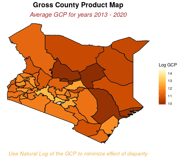
The objective of this blog post is to visualize Country level data on a map with administrative boundaries.
We use dataset collected by Kenya National Bureau of Statistics (KNBS) on Economic performance of the various counties in Kenya.
According to KNBS "Gross County Product (GCP) is a geographic breakdown of Kenya’s Gross Domestic Product (GDP) that gives an estimate of the size and structure of the 47 county economies. It also provides a benchmark for evaluating the growth of county economies over time."
We use R and some of it packages to do the visualization. The project also includes a shiny app that allows a user to easily contrast performance of different counties and how different sectors contributed towards the GCP of the counties.
I have included a tutorial of how to visualize map data using R that can be followed by anyone from beginner to pro.
The source code of the project and the datasets used for this project are availabe on GitHub.
Full Tutorial: https://dasclab.uonbi.ac.ke/dstraining/county-choropleth-gcp.html
Shiny app: KNBS-GCP-Shiny-App

Last updated 2023-06-09 13:59:04 by Kennedy Waweru

